Wednesday
Sally O'Reilly
O'Reilly's lecture was actually a screening of her film "A Rolling Stone: The dynamics of cliche", which was a welcome change from the traditional lecture structure. The documentary-style art film provoked thought about the ideas of cliche by using cliche itself. Imagery such as trees as a symbol for rebirth and life were repeated throughout the film. Overall I didn't make many notes on the film, watching it instead and letting it wash over me. I have to admit that I didn't connect to the work much, it wasn't bad but it didn't inspire me either. I liked the ideas behind the work; the use of cliches can work for or against a piece. It's well known that obvious cliches can really put the viewer off, unless using a cliche to become an icon, which will then unite the viewer with other members of the audience.
Saturday
Thomas Thwaites
Thomas Thwaites was very shy when speaking about his art practice, it felt as though he wanted to justify each and every action, which was endearing, as an art student I know how it feels to be critiqued. In his own words he described him as "a designer... of speculative sorts". His medium of practice is technology, something I don't come across often as I don't find it that interesting. He decided to present to us his "Toaster Project" which started with the quote "Left to his own devices, he couldn't build a toaster. He could just about make a sandwich and that was it" from The Beginner's Guide To The Galaxy (a book turned film). He decided at that point that seeing as he didn't know how to make a toaster either, he'd learn how to. He looked up on wikipedia "how to make a toaster" articles and wrote down the websites description. Thwaites then bought the cheapest toaster he could, so he could take it apart and look at the individual bits that made it up.
The 5 main materials were steel, mica, plastic, copper and nickel so Thwaites had to research where to find these materials. He asked whoever he could from mines and factories how to mine and make key materials. He ended up making everything from scratch and even moulded and built up the circuits to make up the toaster.
 As you can see, the resulting toaster (above) looks bloody terrible, but the whole point of the piece was to investigate the processes into making a toaster rather than slavishly reconstructing one. Although I'm glad the toaster I have at home doesn't look like that.
Thwaites also had the cheeky idea of trying to sell his toaster at John Lewis on their shop floor. Funnily enough no one wanted to buy it, especially as he put the price as around £1000 due to the cost of the raw materials and work put it.
There ended up being quite a bit of publicity due to this project from both sides of the environmental debate, but Thwaites has said that the art piece is open to interpretation rather than taking a stance. He was more interested in the knowledge, time and effort that go into mass production of goods.
Thwaites also discussed future visions of business and environment and how they may work with or against each other.
Thwaites was asked "are humans becoming obsolete against technology?", a question we all wanted to hear his opinion on, to which he replied that he didn't think humans would ever become completely obsolete but by wanting change that "tearing down the system won't help: evolution, not revolution"
The 5 main materials were steel, mica, plastic, copper and nickel so Thwaites had to research where to find these materials. He asked whoever he could from mines and factories how to mine and make key materials. He ended up making everything from scratch and even moulded and built up the circuits to make up the toaster.

Thwaites also had the cheeky idea of trying to sell his toaster at John Lewis on their shop floor. Funnily enough no one wanted to buy it, especially as he put the price as around £1000 due to the cost of the raw materials and work put it.
There ended up being quite a bit of publicity due to this project from both sides of the environmental debate, but Thwaites has said that the art piece is open to interpretation rather than taking a stance. He was more interested in the knowledge, time and effort that go into mass production of goods.
Thwaites also discussed future visions of business and environment and how they may work with or against each other.
Thwaites was asked "are humans becoming obsolete against technology?", a question we all wanted to hear his opinion on, to which he replied that he didn't think humans would ever become completely obsolete but by wanting change that "tearing down the system won't help: evolution, not revolution"
Friday
Polytechnic
The Polytechnic exhibition was an example of artists work from the late 1970's to the early 1980's, but what connects the artists is the way that they experimented with their practice with a focus on narrative.
Many of the works were video pieces, such as "Lenny's Documentary" by Ian Bourn, one of my favourite film pieces at the exhibition. It was based on the grainy black and white films from the 60's, but with a documentary twist. "Lenny" uses the camera as some sort of confessional, discussing his background and life, particularly focusing on class differences, in a frank and candid way.
I chose to photograph this piece of artwork due to the interesting way the photographs were laid out in the room. I felt like the walls were unstable and that I was walking through something temporary, making me want to take in the art work before it vanished. Yet they also became part of the furniture of the room. The photographs themselves are of sets of rooms, recording the intersections and spaces. The pieces create a dialogue with the question of space.


The plaques are arranged into the shape of a diamond, implying that the monuments could continue on around the shape, even covering the wall. The piece constructs questions about identity and heroism; what makes a hero? Will we be remembered as hero's after we're gone?
Rene Daniels at Camden Arts Centre
The Rene Daniels exhibition was split into three main groups, dependent on the aesthetic, and the context, of the works. Unfortunately I lost all the photographs I took at the time (thank you Lumix), so once again Google has saved the day.


The first "section" of the exhibition was very intense; the paintings all contained heavy but bright colour schemes. The room felt quite gaudy and intoxicating as red was the main colour in the room.

This piece "Cocoanuts" grabbed my attention with it's incredibly bright colours and the crazy upside down beard. The subject matter could be painted for humour or simply non-sensical imagery. Another painting "Untitled" was a scene of a farm, covered in smoke and creating a picture of destruction.
The second "section" of works were identified by images of repitition, usually with bright colours and broad strokes aesthetically. Much of the subject matter appeared to me to be about the idea of what it is to be human; whether creating a dialogue about society or exploring the process of thought. The namesake of the exhibition, "Painting on Unknown Languages" featured what appeared to be many panels of glass on a plain blue background. The pattern of the panels tapered each side (like a slideshow sequence on Mac Pro). I interpreted the painting as a dialogue between the conscious and the unconscious, with the glass panels representing frames of thought.

This painting (above) was the most interesting to me, as I interpreted the aggression and a certain cannibalistic connotation, as the fish appear to be eating each other, and become some sick scene of human nature, where mankind seems to destroy each other. Many of the paintings appear to be friendly but menacing, with bright coloured acrylic paints and a dream like way of painting.
The third "section" was a lot more childlike, but looked like cartoons, as the black and white sketches were quite rough but with splashes of colour they were refreshingly simple. The white temporary walls were in diagonal angles and images were painted onto them; figures, trees and words were painted in quite a childish style as the words became another (or made up) language. I liked how different this part of the exhibition was, a complete contrast to the first section.
Thursday
Nina Beier at Laura Bartlett Gallery
The Nina Beier exhibition was quite disappointing, as the gallery itself was incredibly small. In fact, the group I went with couldn't all fit in the room at once. The art works were definitely affected by this as I didn't feel I could view and then connect with the pieces properly.

The exhibition itself included a number of covered canvas', by which I mean box shapes were fastened to the walls in the shape of what could have been canvas' and were covered in black fabric, which meant you were unable to see through it. We were told by the curator that underneath the fabric were Pop art posters and illustrations. I have to admit that I didn't appreciate this exhibition as much as others. Whether that was to do with me not connecting to the exhibition by not understanding it, or because of how claustrophobic I felt, the point missed me completely and I ended up feeling frustrated because of that.
Walter Swennen
Swennen's main medium is by using "objets trouvee", or found objects, to produce works that borrow iconography or become almost 3D due to his use of thick grained paint that he mixes himself. What is apparent is that Swennen makes his work personal by divesting much of his time recycling objects or substances to become something new. What Swennen does is make old useless objects functional again.


One theme that reoccurs in Swennen's work is the use of text and image, particularly in the extremely pastel-coloured works such as this piece above. The thick paint is used to create a loose texture, giving up a narrative to become a formal painting. There is something quite sobering due to the quiet pale paint neighbouring the flamboyant pieces from before. This particular piece is an example of "archeological" art; where the dust, coffee etc is mixed in with the paint to give it a thick grainy texture that builds up with the layers. Not only that but the use of a found object to paint on also gives
As you can see, the use of language in the painting adds to the connotation of layers, with some letters appearing to be covered up or "white washed". However what you can see seem to be painted in reverse, lending a childish quality to this otherwise quite mature painting. It looks like the words covered up are made up, gobbledegook basically. It reminded me of young children making up a language to confuse their parents, which made me grin quite abit. Overall there was something incredibly "likeable" with Swennen's work, whichever level you decided to view it on.
Something that impressed me was the curators passion for this exhibition; the juxtaposition of the pale and the coloured mixed together made the gallery space look cluttered in a homely way, it wasn't too intense but the overall effect was still attractive. Also the curator herself was able to answer any questions we had about the work or Swennen himself, something I haven't ever felt able to do in a gallery before.
Wednesday
Freud Museum, London
The Freud Museum is one of the most famous tourist attractions in London; a surprisingly humble and small home in a residential area (I walked past it five times before seeing the museum sign). Due to Sigmund Freud's notoriety as a psychoanalyst, I was expecting the usual type of warehouse or gallery converted into an homage to Freud. Instead I was faced with what was somebody's home, covered in rugs, framed photographs and trinkets.

Of course, the main focus of the house was the famous couch, where patients were seen and analysed. All over the house, extracts from Freud's essays, journals and letters were printed out and put next to photographs of his family and colleagues.
Hew Locke at Hales Gallery
The Hew Locke exhibition was definitely one of my favourites, much to the disappointment of one of my tutors. I loved the effect that the beads gave, they looked like lines and drips of ink and also created a shadow on the wall behind them, making the entire room appear to come alive. Clearly the use of materials was a major choice in the installation; the beads can't have been easy to attach to the wall, let alone manipulate into the intricate detail of the images. The entire room was covered in the beads, that form a procession. The figures in the procession draw upon a lot of historical and contemporary references, such as Medieval frescos, Venetian architecture and Egyptian tomb paintings. They might appear to be cliches of the "Last Procession" but the idea of the endless parade of frightening figures transforms the old reproduced image.


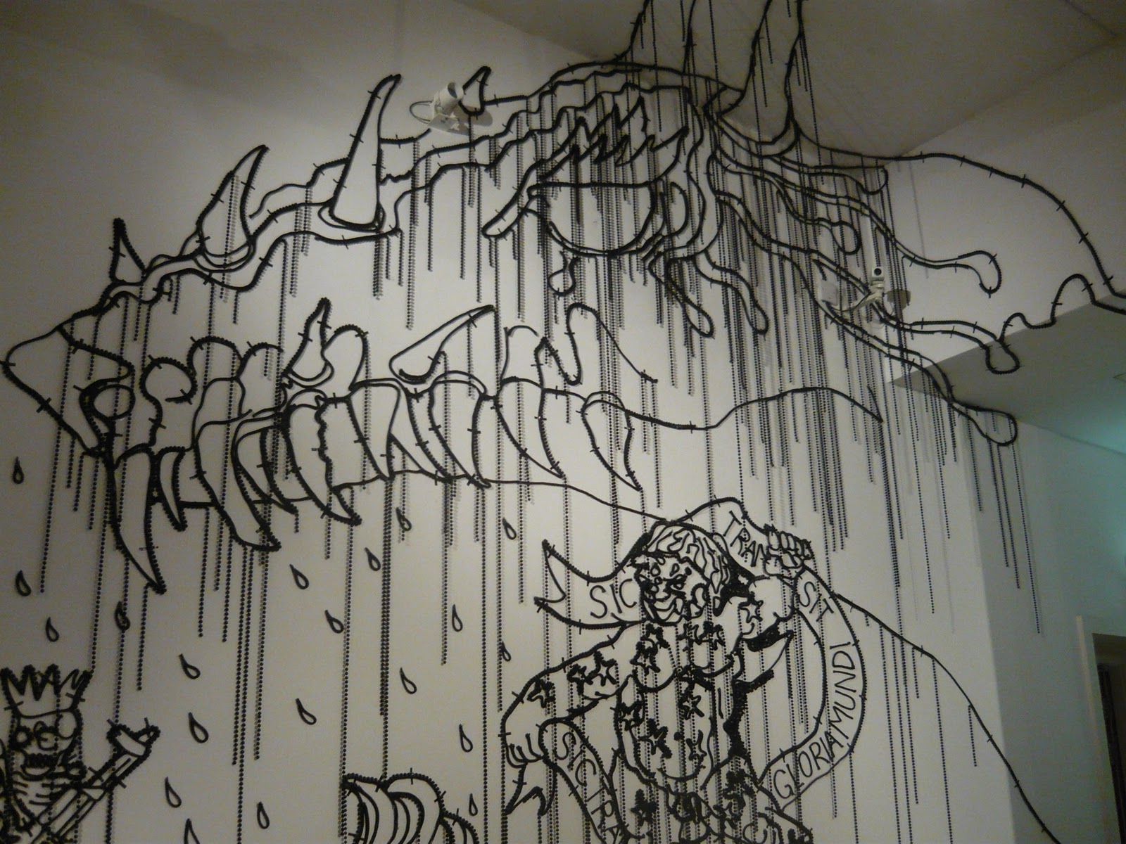
The examples of the exhibition that I've shown here are some of my favourite images from the gallery. I loved the terrifying winged man the most; it has been beautifully created but it's also kind of creepy - my favourite style. The bead "drips" appear to be like chains, holding the winged man in some kind of void.

Tuesday
Banksy at DocFest '10
I've followed Banksy's work for a while now, and like his graffiti as well as his more recent ventures into installation pieces. His first film piece "Exit Through the Gift Shop" has had mixed reviews, which is like Banksy's work anyway; you either love it or hate it.
Here's the trailer to "Exit Through the Gift Shop"
So, it turns out that Thierry Guetta, presented as Mr Brainwash eventually within the film, really is a graffiti artist, putting my previous theory pretty much in the bin.
Here's the trailer to "Exit Through the Gift Shop"
The film itself is meant to be a documentary, although with Banksy's sense of humour I'd call it a "mockumentary" instead. The film features a man called Thierry whose interest in street artists has led him all around the world, filming their underground spray painting and avoiding the police. The documentary style seems to romanticise graffitiing, and the fact that it's against the law. But the way the artists are portrayed as quiet and removed from Thierry, no matter how much he described them as being like "family". When the film maker meets Banksy, who, as usual, is masked or pixelled out so he won't be identified, it seems as though Banksy was looking after the film maker, as he sets him tasks that Banksy later describes as "getting out of control". You get the feeling as though the narrative is meant to pull similarities from the story of Frankenstein's monster.
So, it turns out that Thierry Guetta, presented as Mr Brainwash eventually within the film, really is a graffiti artist, putting my previous theory pretty much in the bin.
No, it's not. It may be a hoax, but it's still funny. The fact that we all think that the film is a complete hoax only serves to show us how cynical we really are. Although the facts, timelines or events might have been set up to be more theatrical or comical than they really were, surely we watch films to be entertained? I may have been wrong about Mr Brainwash being a made up character, but I still loved watching the film. The rough handheld quality to the camera work FELT real, whether it was or not. I liked feeling like I could sneak peek at graffiti artists because I'm envious of them. I liked the character of Thierry because he was a loveable fool, which is exactly how Banksy wanted to portray him. He may make him look like a sneak for creating a media hub and attracting publicity to sell paintings, but then Banksy does the same thing. I still like the Frankenstein's monster metaphor: Banksy created the character of Mr Brainwash through this film, and then set him loose, seeming to regret it instantly, but it was too late.Is Banksy’s ‘Exit Through the Giftshop’ a hoax too far? - The Times Online
Subscribe to:
Posts (Atom)